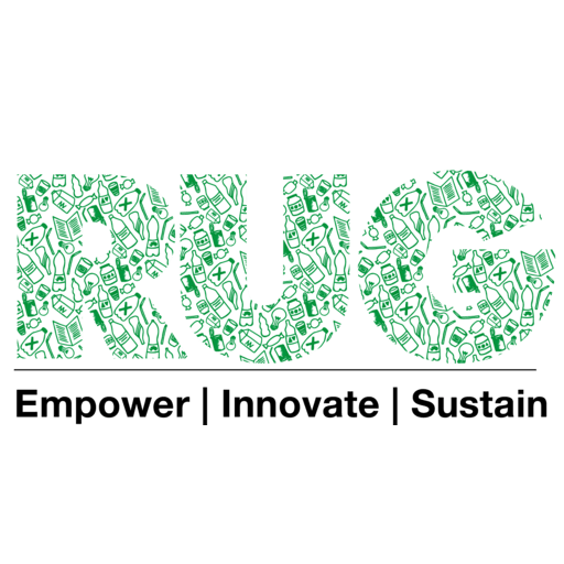
Today, we are more than excited to share with you the launching of our new logo. The new design consists of a freshly green graphical feature of our brand name abbreviation RU! (Recycle Up!) shaped by a variety of different pictograms that visually represent parts of our work. A simple text line below shows our full name.
Our old logo was a beloved team member and faithfully accompanied our organization over the past 5 years. However, we want to share with you the main reasons why a logo design change was deemed necessary for us:
- Modern: our team is damn young, 21st-century-modern and pretty bold: and this is exactly what we want to show with our new logo. It is time to express ourselves through something more playful and vital, just the way we are.
- Representative: on a regular basis, our organizations’ focus was misinterpreted and we were expected to represent a business in the sense of a recycling company. Our name together with the old logo’s graphical focus on recycling did not fully represent our broad field of activities which mainly consists of educational and empowerment work. The new logo aims at eliminating this interpretative bias.
- Appealing: the old logo design was pretty dominant and therefor also determined the design of materials a lot. If placed on any other color than white, it resulted in a color overload and didn’t look appealing anymore. It also didn’t allow for a black & white negative.
- Flexible: we want to be open to run Recycle Up! projects beyond Ghana’s borders at some point: several requests from other countries reached us in the past 5 years. The Ghana national colors of the old logo wouldn’t allow for such an expansion among the same umbrella. The new logo on the other side can be adapted easily.
For these reasons, we want to thank our old logo for the many years of loyal cooperation and look forward to the dawn of a new era – in fresh green! 🙂
Special thanks to the whole Recycle Up! team for collectively developing the foundation for a new design that represents us, to Felix Hollederer for the profesional conceptualization and to Luisa Fischer for the beautiful illustration!

